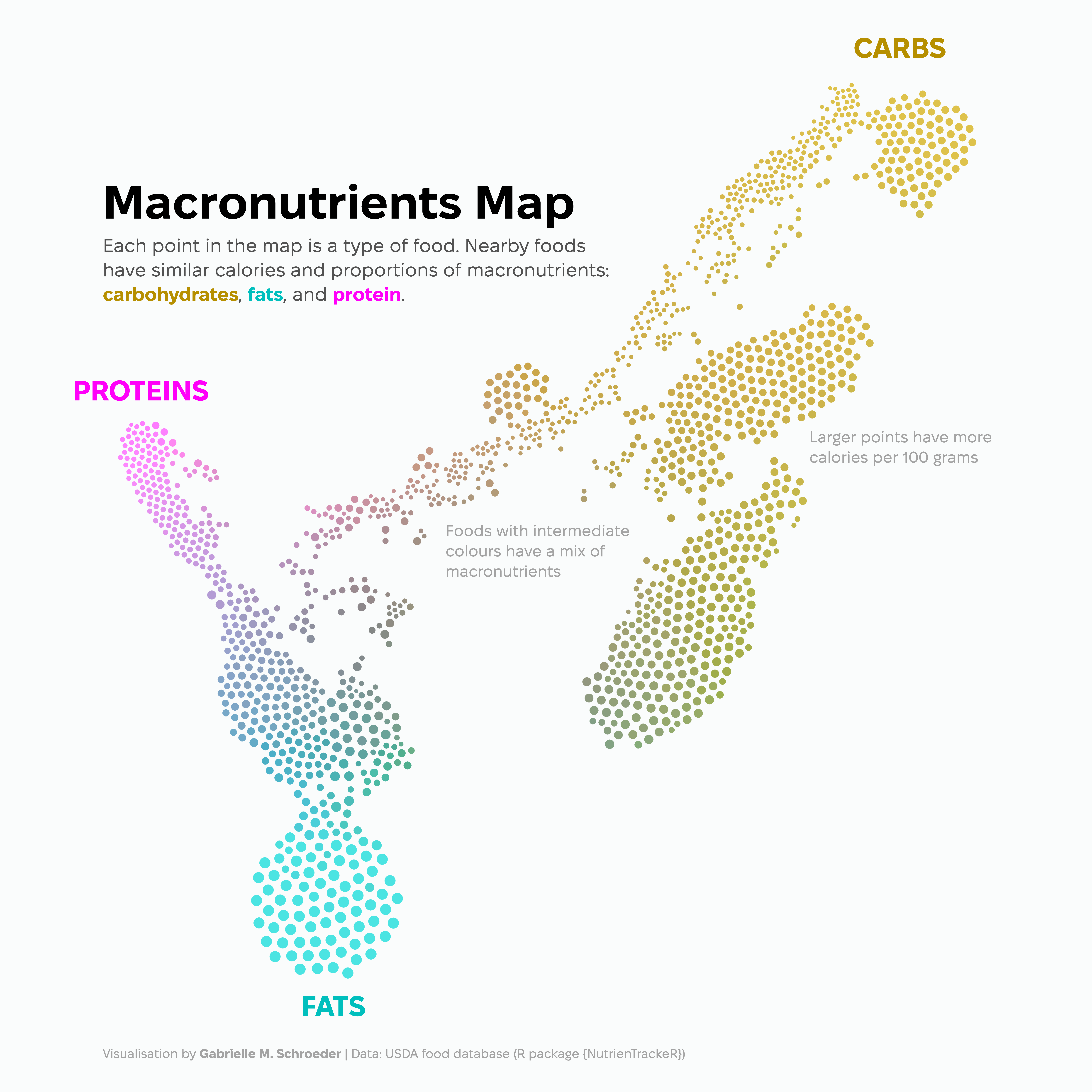
Macronutrients Map
Design process
This visualisation is an idea that’s been in the back of my mind for a few years. I’ve done a lot of macronutrient tracking in the past to help support my strength training goals, and I thought it would be fun to visualise the similarity of different foods in terms of this nutritional content. I think this approach is especially useful for foods with a mixture of macronutrients - it’s interesting to see cases where very different types of foods have similar compositions. For example, the indigo section above (between proteins and fats) has a lot of cheeses, but also eggs, sausage, turkey bacon, and pigeon!
I selected a representative subset of foods from the United States Department of Agriculture (USDA) food database (provided by the R package {NutrienTrackeR}). Foods are plotted closer together if they have a similar amount of calories per 100 g and similar proportions of macronutrients (carbs, fats, and proteins). I reinforced the macronutrient information with a ternary colourmap computed by the R package {tricolore}: each food’s colour is based on the relative amounts of the three macronutrients. Meanwhile, calories per 100 g is encoded by the circle sizes. Calorie content is mostly dictated by water content (not shown) and the food’s macronutrients.
I used Plotly to make the chart interactive, allowing the viewer to explore the relationship between different foods. Hovering over a point provides some nutritional info for that food.
Technical details
Code for producing this visualisation is available on my GitHub.
Food selection
The full USDA food database in the {NutrienTrackeR} package has an overwhelming number of foods: 7,754 . I pared this down to 1,530 foods using a combination of subsetting, heuristics, and a small amount of manual curation. I wanted to have a wide variety of foods while focusing on 1) less specific entries, 2) fresh and unprepared foods, and 3) foods with fewer ingredients (i.e., not complete meals or dishes). However, I kept some simpler processed and multi-ingredient foods, such as bread and yoghurt. I also removed some of the more unusual entries such as “raccoon.”
My wrangling steps included
Removing database categories that didn’t meet my criteria (e.g., “Fast Foods” and “Restaurant Foods”).
Removing entries with more than six words (excluding some phrases like “without salt” from the word count since they signified a simpler version of the food). This step removed very specific entries such as “Beef, chuck, shoulder clod, shoulder top and center steaks, separable lean and fat, trimmed to 0” fat, all grades, cooked, grilled” (21 words).
Removing alcoholic foods and beverages since they have a fourth macronutrient - alcohol - that I didn’t want to include in this visualisation. I identified these entries by estimating each food’s calories based on their carbs, fats, and protein content. I then found foods where this calculation greatly underestimated the true calorie content (since the remaining calories come from the alcohol). I removed any remaining alcohol-related entries using string matching to the food names.
Removing brand name foods. The USDA database capitalises most of the company names in the database, so these were easy to filter out by finding food names with multiple consecutive capital letters. I then manually filtered out some missed branded entries.
Removing entries that contained words that indicated cooking or processing - e.g., “cooked”, “roasted”, or “frozen”. I was careful here to keep longer versions of these strings that indicated the opposite - e.g., “uncooked”.
Together, these steps removed a lot of redundant entries, resulting in a more manageable map to explore.
I also think this plot would work well using more tailored data, such as food from one person’s diet.
Layout
This visualisation uses a dimensionality technique called t-distributed Stochastic Neighbour Embedding (t-SNE), which embeds data in a small (e.g., two) number of dimensions to make it easier to visualise. The algorithm tries to optimise the new layout so that similar observations (here, foods) are placed close together. I based the similarity of the different foods off of their relative amounts of macronutrients and their calories per 100 g. Using relative macronutrient content (e.g., 20% protein) rather than the absolute macronutrient values (e.g., 10 g protein per 100 g) means that non-caloric content, such as water, is ignored for the embedding. I also normalised these features so that higher-magnitude features (such as calories) did not have a greater impact on food similarity.
t-SNE is not deterministic - you can get different embeddings depending on where you first place each point. It also has a parameter, perplexity, that controls how much the algorithm focuses on nearby versus global similarities. To find an embedding that worked well for this visualisation, I systematically tried different starting configurations and perplexity values. I also experimented with scaling how much calories contributed to food similarity, as I wanted the layout to be primarily driven by the macronutrient content, with calories further separating foods with similar macronutrients. Ultimately, I divided the normalised calories by four to decrease their impact on the embedding.
The initial t-SNE embedding that I selected looked something like this:
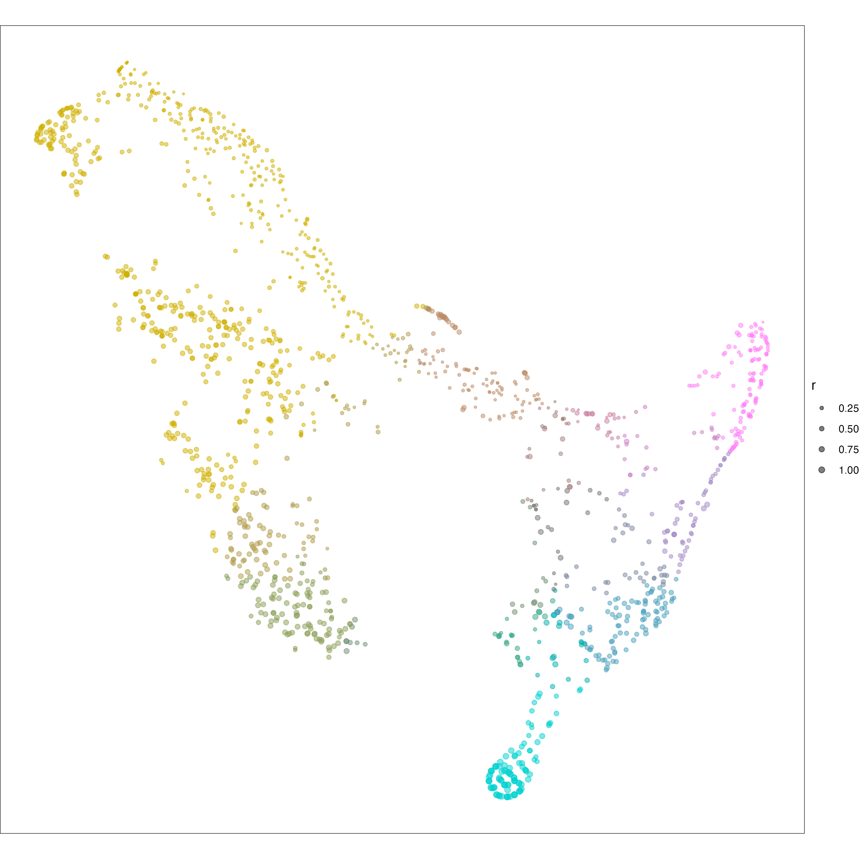
This plot is pretty, but difficult to interact with because of the overlap between different foods, especially with the point size scaled by calories. I therefore used the R package {packcircles} to repel nearby points, resulting in a final layout without overlapping points. I also flipped the layout to work better with my text annotations - rotated or flipped embeddings are equivalent since they have the same distances between points. Here’s a non-interactive version of the final, annotated layout:
While making this chart, I searched for any similar visualisations. I didn’t find any maps using these exact features, but there is a published static t-SNE embedding of USDA food data that uses the complete nutritional information (including micronutrient content such as vitamins). However, there are many more types of embedding approaches, so I may have missed other macronutrient representations - if you find any, I would love to see them!