I designed this visualisation for Viz for Social Good’s collaboration with the World Health Organisation (WHO). For this project, the WHO provided a dataset on global disabilities; their report on the data is available here. The WHO asked for impactful visualisations that raised awareness about disability. It was also key that the visualisation was accessible (e.g., by meeting accessibility standards). My visualisation was one of five (of 49) designs selected by the WHO for a panel presentation.

Anyone can have a disability
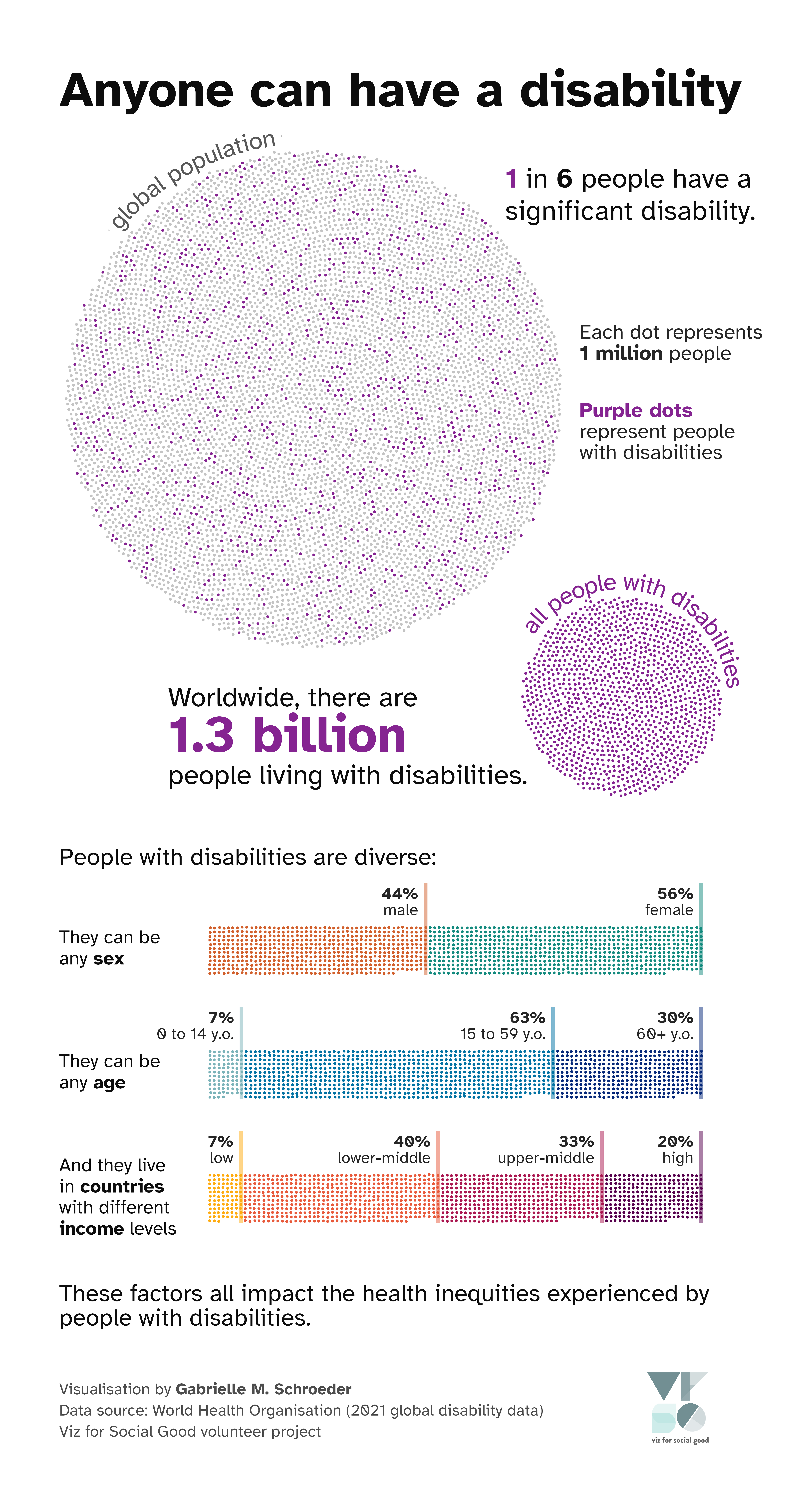
The visualisation above represents every 1 million people in the world with one small dot. About 8,000 dots are grouped together in a circle to represent the global population of almost 8 billion people. Approximately 1 in 6 of these dots (around 1,300 dots total) are highlighted to represent the 1.3 billion people living with disabilities worldwide.
People with disabilities are diverse:
They can be any sex: 44% are male and 56% are female
They can be any age: 7% are 0 to 14 years old, 63% are 15 to 59 years old, and 30% are at least 60 years old
And they live in countries with different income levels: 7% in low income, 40% in lower-middle income, 33% in upper-middle income, and 20% in high income countries
These factors all impact the health inequities experienced by people with disabilities.
Visualisation sources:
Story
I chose to present the key message that I took away from the WHO’s VFSG presentation: anyone can have a disability. In particular, disability is (1) common, and (2) impacts people with many different demographics. In other words, people with disabilities are a large and diverse group. I decided to keep the data analysis and statistics fairly simple to focus on this main message.
As such, I used the demographic information to answer the question, “What are the characteristics of people with disabilities?” (for example, what percentage of people with disabilities are female?) Importantly, my approach does not reveal the prevalence within each demographic, which could potentially lead to misinterpretations. For example, someone might assume that disability is less prevalent in high-income countries, even though high-income countries actually have the highest prevalence (see pages 23-24 of the WHO disability report). However, my visualisation can also correct erroneous assumptions. For example, although people who are 60+ years old are more likely to have a disability, the global population structure means that most people with disabilities are actually under 60 years old. Thus, these statistics can challenge stereotypes about people with disabilities.
I also wanted to present this data in a memorable and impactful way. One of my first experiences seeing data visualisation used as a story-telling tool was the New York Time’s article on how race impacts economic mobility. Rather than just presenting bar charts or a Sankey diagram, the article uses animated points to represent the economic outcomes of individual people. Years later, I still remember that message because the data was connected to individuals. Inspired by that approach, I decided to try capturing the global scale and impact of disabilities by representing every one million people with one small point. Without animations, I don’t expect my visualisation to have the same impact as the New York Times charts, but my hope is that this visualisation will encourage people to sit with the data and mentally grasp the number of people living with disabilities. However, representing the data this way could also lead to accessibility issues if people struggle to perceive the small dots. I aimed to address these issues with other design choices (discussed below).
Accessibility
Data encoding
As I described above, I decided to represent one million people with a small dot. I then coloured these dots based on the people’s characteristics - e.g., whether they have disabilities. Since these small elements could be difficult for people with visual impairments to perceive, I ensured that all of the statistics were also encoded by the shapes formed by the dots:
While the dots represented by people with disabilities are mixed into the circle that forms the global population, I extract those dots into a second, smaller circle that represents people with disabilities. The relative areas of those two circles encode the percentage of people with disabilities: the people with disabilities circle is approximately 1/6th the area of the global population circle.
The demographic information forms stacked bar charts, with the length of each section encoding the corresponding percentage. This double encoding should help everyone understand the data, as it’s much easier to perceive differences in lengths than differences in dot numbers.
Font, text, and contrast
After researching factors that impact font accessibility, I decided to use Atkinson Hyperlegible, a font designed by the Braille Institute for people with low vision. It’s also freely available under the Open Font License, which was one of my requirements. Atkinson Hyperlegible uses extra space and exaggerated letterforms to make it easier to distinguish similar characters. The designed asymmetries also make it easier to distinguish letters that are mirror images of each other, such as p and q (e.g., compare the q in “inequities” vs. the p in “people” in my visualisation). The font was designed to be suitable for general audiences as well, and the distinct letterforms can improve readability for many people.
All of my text is either dark grey or purple that meets the WCAG 2.1 AAA standards for contrast against the white background (checked using Adobe’s accessibility tools). I also checked the contrast of the purple dots against the grey dots in the “global population” circle.
The size of all of the text is 10+ pt when the image width is 6.5+ inches, with the most important messages in larger font sizes. The visualisation has a high resolution so that it can be viewed at a larger size if desired.
Data accessibility
The image has the following alt text:
A visualisation that represents every 1 million people in the world with one dot to show that 1 in 6 people, or 1.3 billion people worldwide, have a significant disability. To show the diversity of people with disabilities, the dots are rearranged into three stacked bar charts that provide sex, age, and country income level demographics.
One downside of using R to make a static visualisation is that, to my knowledge, there isn’t a way to allow screen readers to navigate the different chart elements. To make sure the key messages are still accessible, I also provide a text version of the main messages and statistics below the visualisation.
Other design choices
Colour significance
During this project, I learned that there are many colours used to represent different types of disability. I chose purple, which is becoming a symbol of disability as a whole.
