PRISM Dashboard
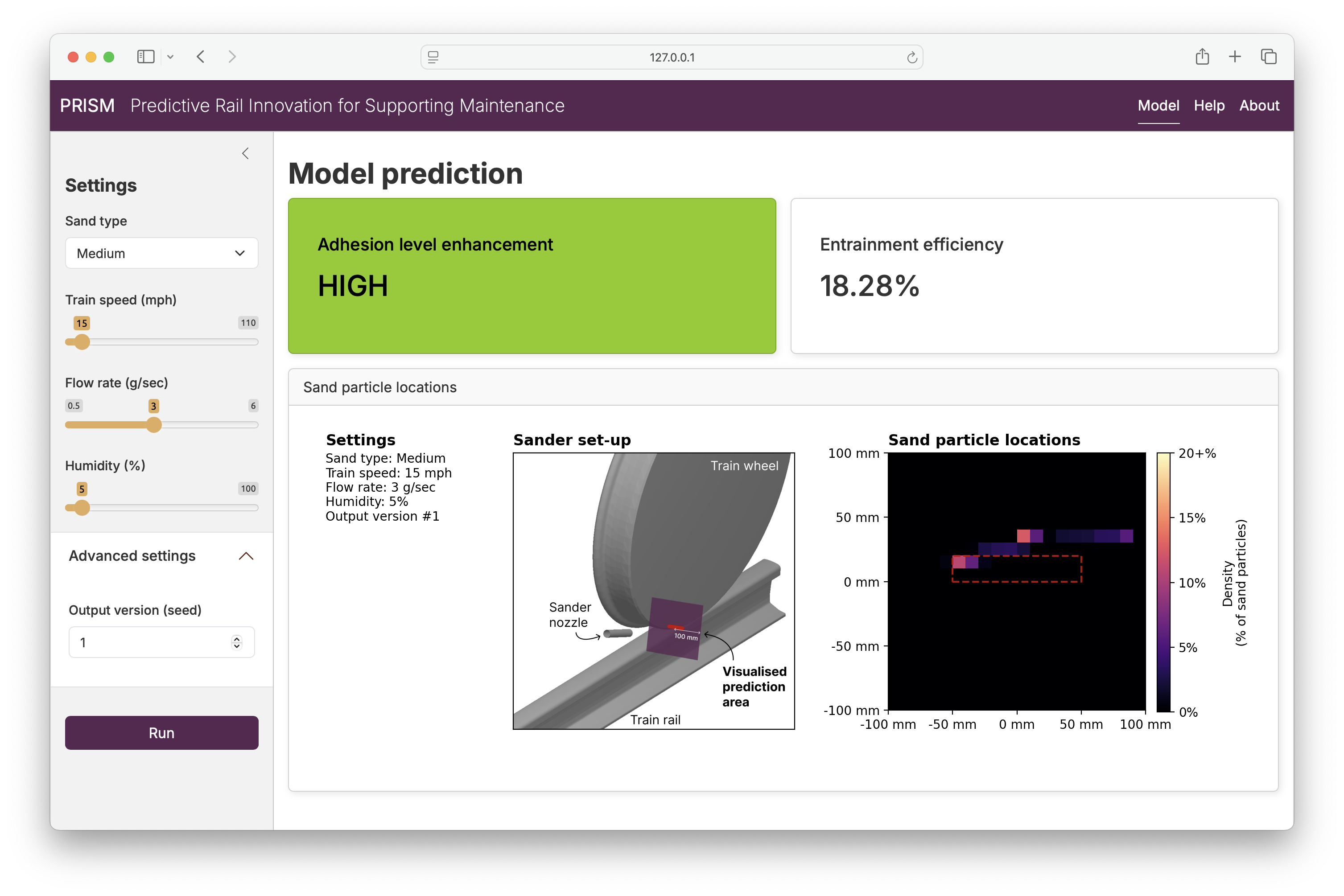
Background
On train railways, poor rail adhesion (e.g., due to leaves on tracks) is a common and significant challenge that can cause delays, accidents, and high costs to the rail industry. The goal of the Predictive Rail Innovation for Supporting Maintenance (PRISM) project was to develop a system for predicting the effectiveness of different interventions - such as applying sand to the tracks - at improving rail adhesion.
PRISM was funded by UKRI Innovate UK and was a collaboration between engineering researchers from both Newcastle University and Durham University.
Challenge
I joined PRISM towards the end of the project to develop a dashboard that would run their model (a PyTorch neural network) and display the predicted rail adhesion for the user-specified conditions. The application would serve as an early prototype of a monitoring and intervention system that could be used by the rail industry to address poor rail adhesion.
This dashboard had several requirements. Most importantly, it needed to interface with their Python model so that the user could easily run the model predictions and see the returned outputs. It also needed to use a framework that supported rapid prototyping due to both the project’s time constraints and the concurrent development of the model; I would need to adapt the dashboard as the model inputs and outputs were finalised. Additionally, the dashboard needed to have good UI/UX design and be aesthetically pleasing to meet the project’s commercial goals.
In addition to developing the dashboard, I also provided training on
- collaborative GitHub development
- Python environments
- Python packaging (e.g., how to turn a machine learning model developed in a Jupyter notebook into a Python module that can be called by the application’s server logic)
Solution
I decided to create the dashboard using Shiny for Python, which is a powerful Python framework that allows for rapid development while still providing high levels of control and customisation. By choosing a Python framework, I was able to directly import and call the functions for running PRISM’s model predictions, letting me rapidly integrate their work into the application. Because Shiny uses HTML/CSS and Javascript under-the-hood, I could also leverage these web technologies to customise the dashboard’s appearance and behaviours.
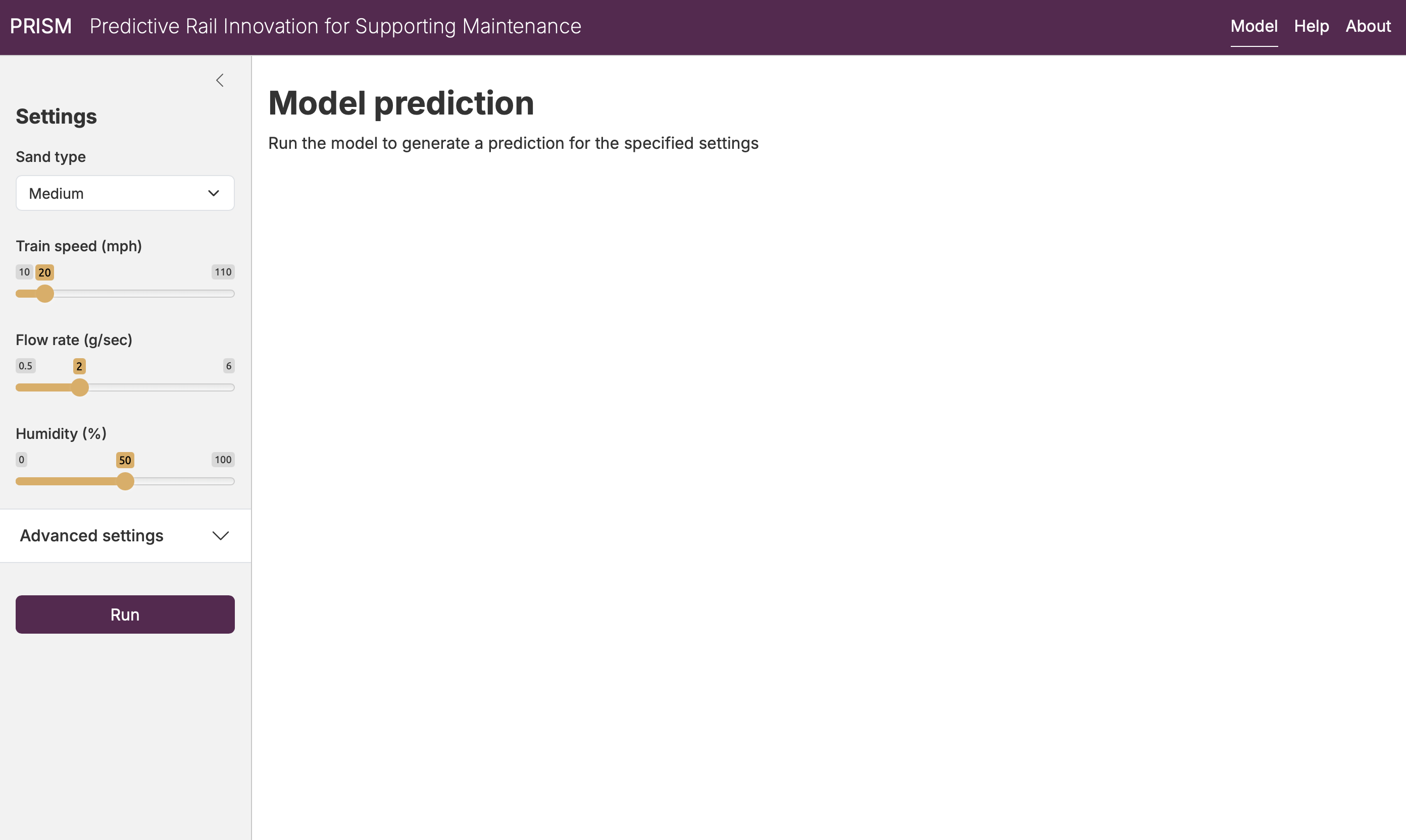
I worked with PRISM’s researchers to determine the information that the user would need to provide the model, as well as the outputs that would need to be displayed:
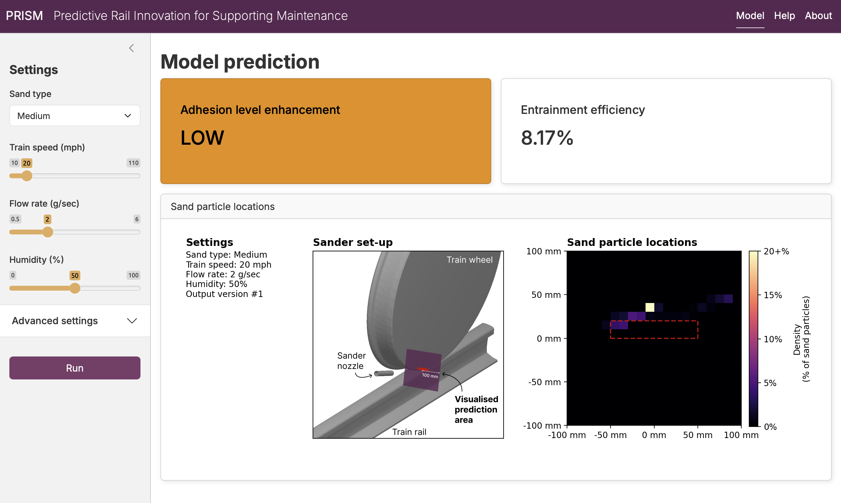
In addition to their detailed model predictions and raw measure of adhesion improvement (“entrainment efficiency”), we qualitatively summarised the intervention’s impact with an “adhesion level enhancement” value, which ranged from very low to very high. To accentuate this key summary measure, we changed the colour of corresponding card based on the value:
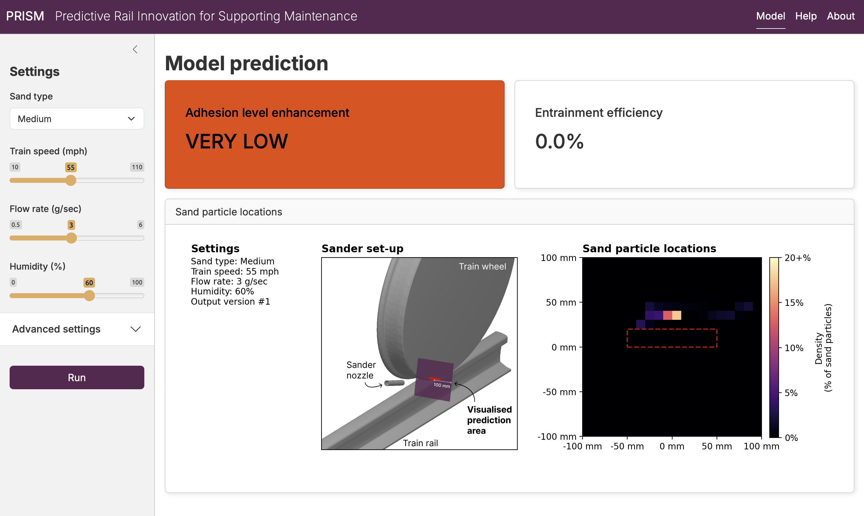
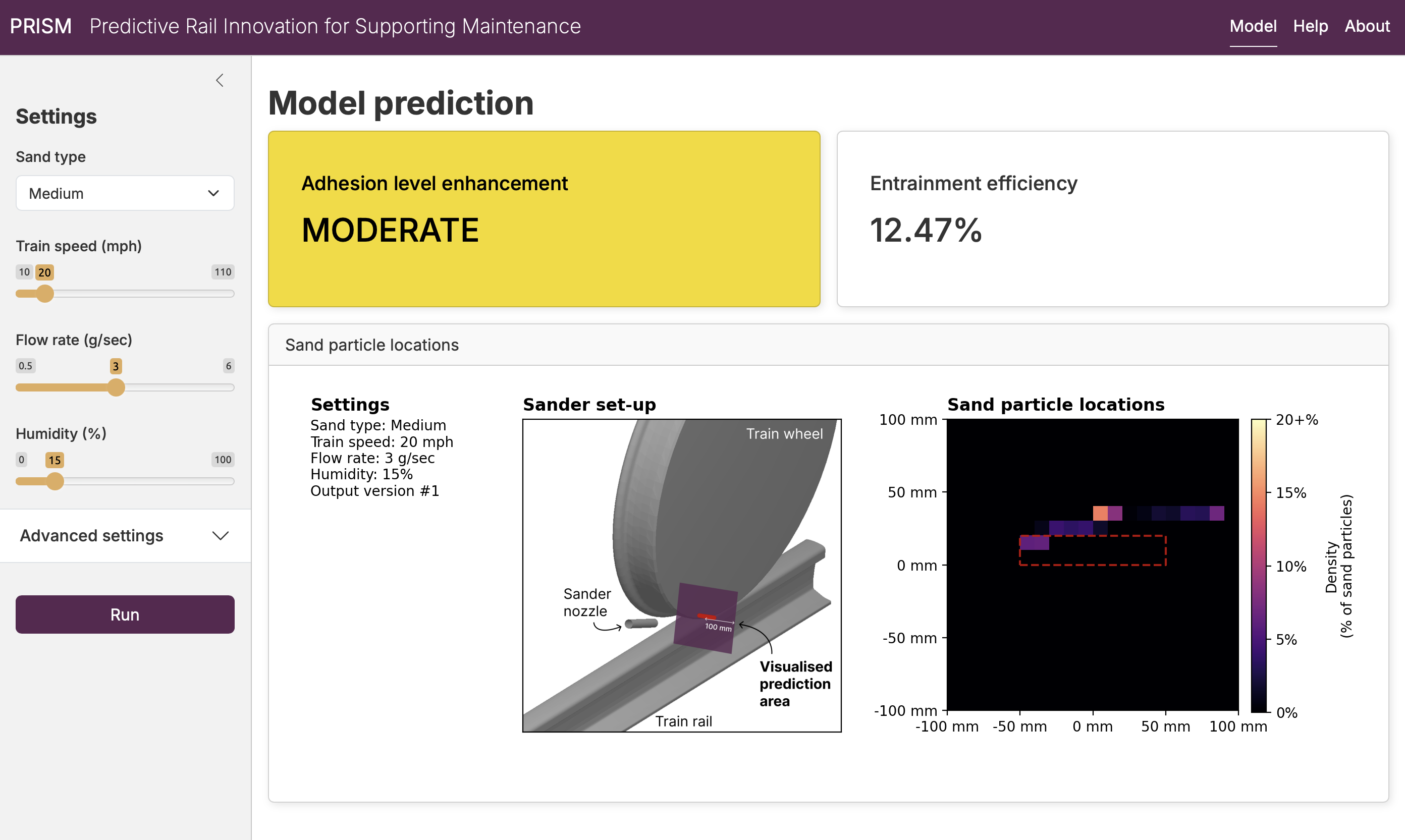
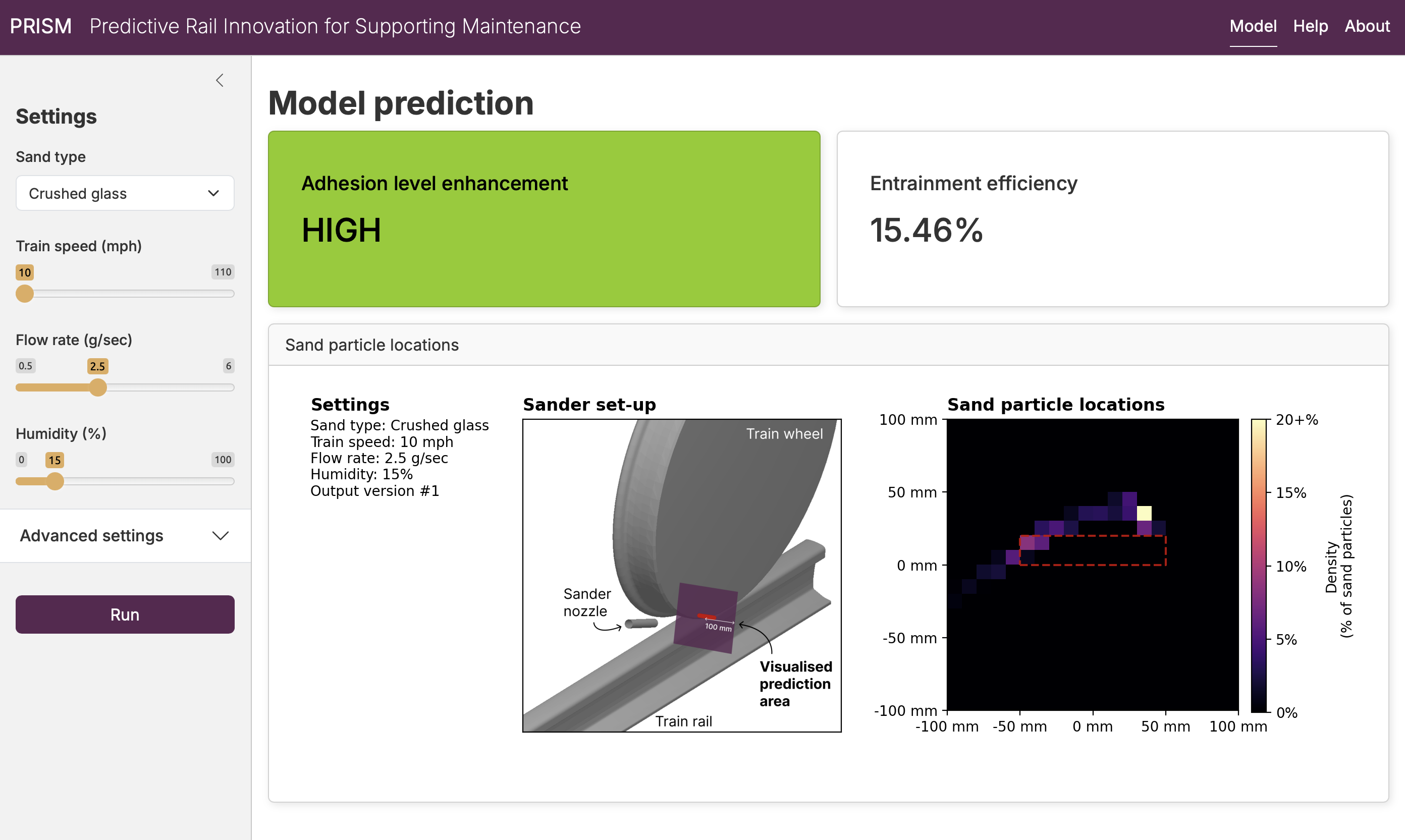
Information design decisions such as these help translate complex research into actionable insights.
I also worked with the researchers to develop a new figure showing the layout of the train wheel, tracks, and sander (“Sander set-up”). This diagram helps orient the user before showing the more detailed model predictions (the location of the sand particles next to the train wheel).
Because the model is not deterministic - the predictions can slightly change from run-to-run - we let the user set a random seed under the “advanced” options to control which version of the output is shown. We limit the seed to between 1 and 1000 and provide feedback if the user tries to input a value outside of this range.
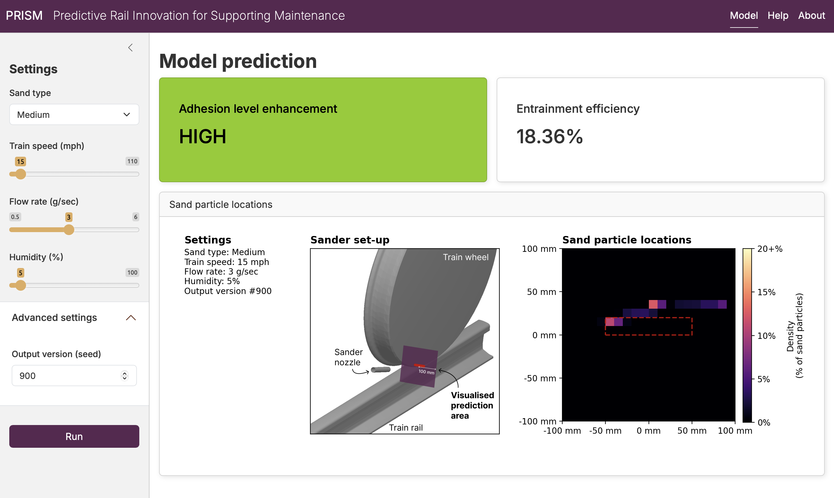
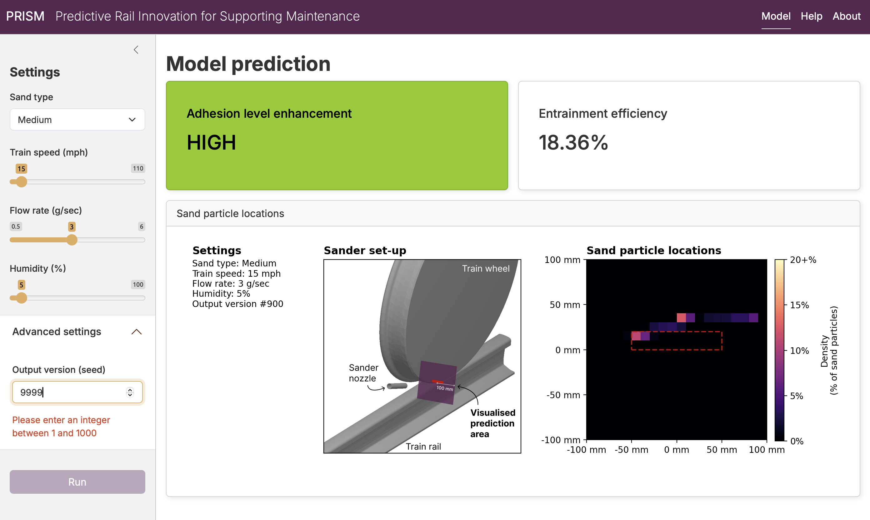
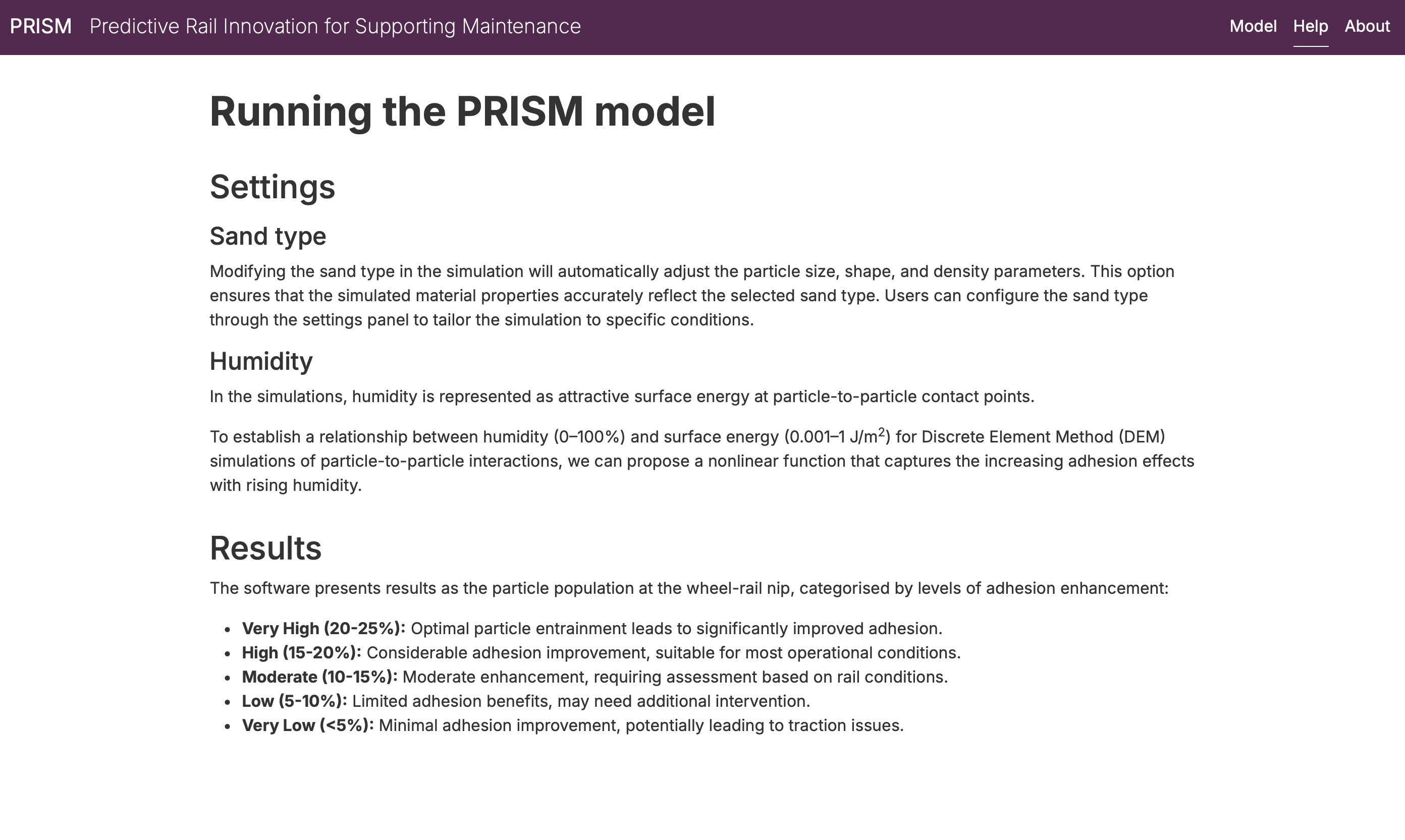
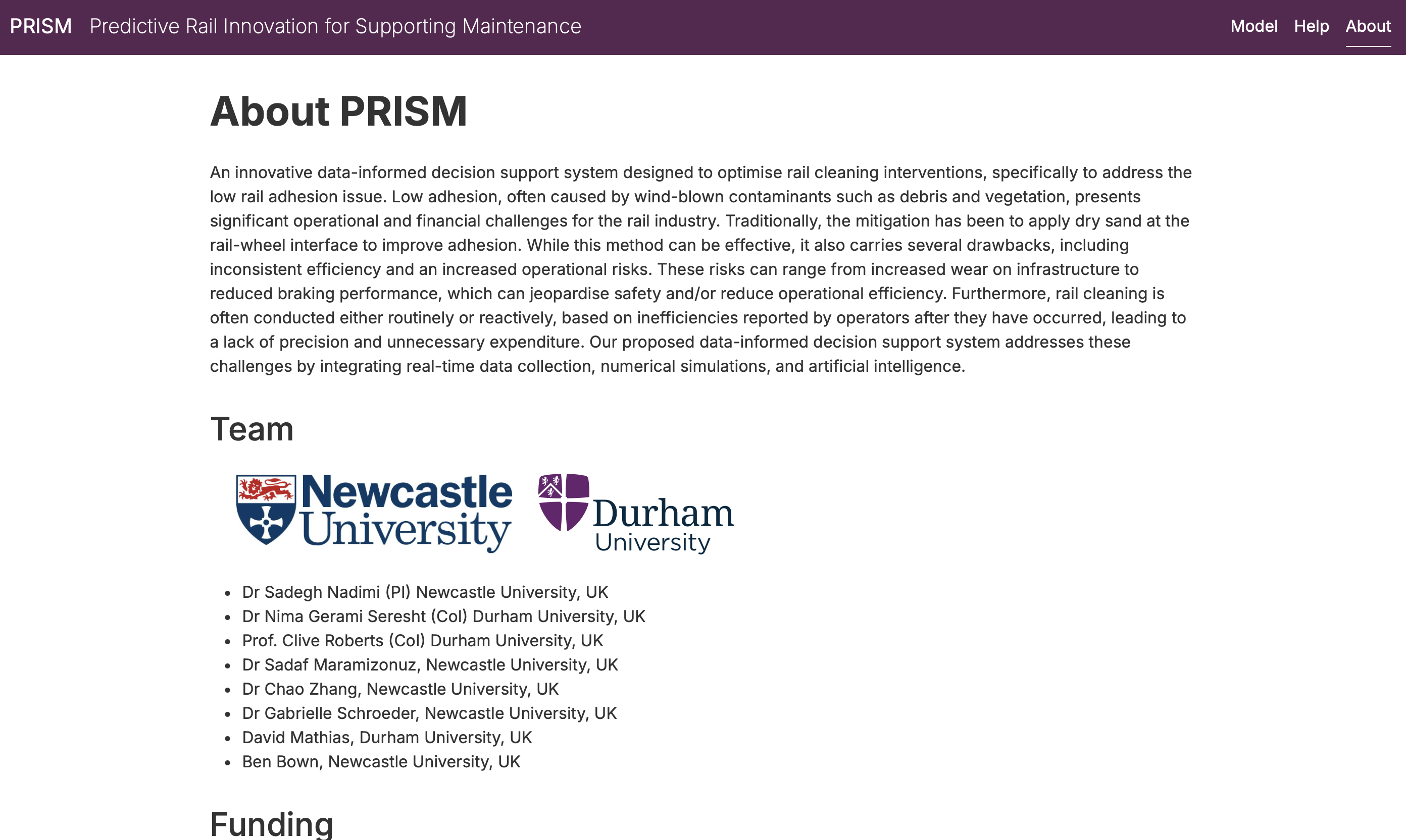
Additional pages of the application provide information about the model and project:

Next steps
Some preliminary next steps to improve the dashboard would be
- Updating to the colour encoding of the “adhesion level enhancement” measure to make it colour blind friendly (or adding an option to switch to a colour blind friendly mode)
- Packaging or deployment for distributing the application without setting up a Python environment
Ultimately, the team envisages building on this work to create an application that monitors and reports on rail adhesion in real time, using sensors and weather reports to provide input for the model without manual user inputs.